
Analyze an existing app and identify ways micro animations can be used to improve the current user journey.


Micro animations are helpful to the user experience by providing visual feedback to the user and emphasizing key changes, steps, or drawing focus on what the user should be looking for.
By understanding the purpose of micro animations and how they will affect our users, we are better able to use them in an effective way, in areas that would benefit from them.
Bird’s mission is to make cities more livable by reducing car usage, traffic, and carbon emissions.

Create Community

Drive Change

Bring Others Along
Create Community
Drive Change
Bring Others Along

Ease Congestion

Environmentally Friendly

Greater Availability
Ease Congestion
Environmentally Friendly
Greater Availability
In order to uphold the brand values and impacts of Bird, we integrated them into our motion design. We kept a sense of motion and progression through the design to reflect the value of driving impact. By providing the user with a sense of progression through the process, we are able to reflect the forward-thinking goals and impacts that the app is working towards.
In the visual design, we made sure to include details of the environment the scooter would be in (ei. Bike lanes) to provide cues that it’s environmentally friendly and is contributing to easing congestion.

Understand the current process by mapping out the user experience of renting a scooter from entering the app to ending the ride.

By mapping the steps, users’ feelings, app touch-points and current micro animations, we will be able to see patterns and where holes exist in the current process. From this, we can draw insights and connect them to opportunities to use micro animations.
To analyze this process we watched multiple users use the app to rent a scooter, some for the first time and some more familiar with the process. We also explored the app ourselves to see what it was like in our area and to familiarize ourselves with recent updates.


To gauge how Bird compares to its competitors we analyzed the Lime scooter app and compared style, notifications, information architecture and how they used micro animations
Uses micro animations to emphasize the cost-effectiveness of the app
Uses pop-up notifications to provide promotions to the user

Locating scooters in the app is a major touch-point that can be frustrating to users when it isn’t clear which scooter is closest.
Provide a micro animation that draws attention to the closest scooter and specifies how far away it is.

Users are unsure of how to get started with the ride and what they'll have to do to begin
Draw attention to the button on the main page to begin the ride and provide insight into what pressing the button will do.

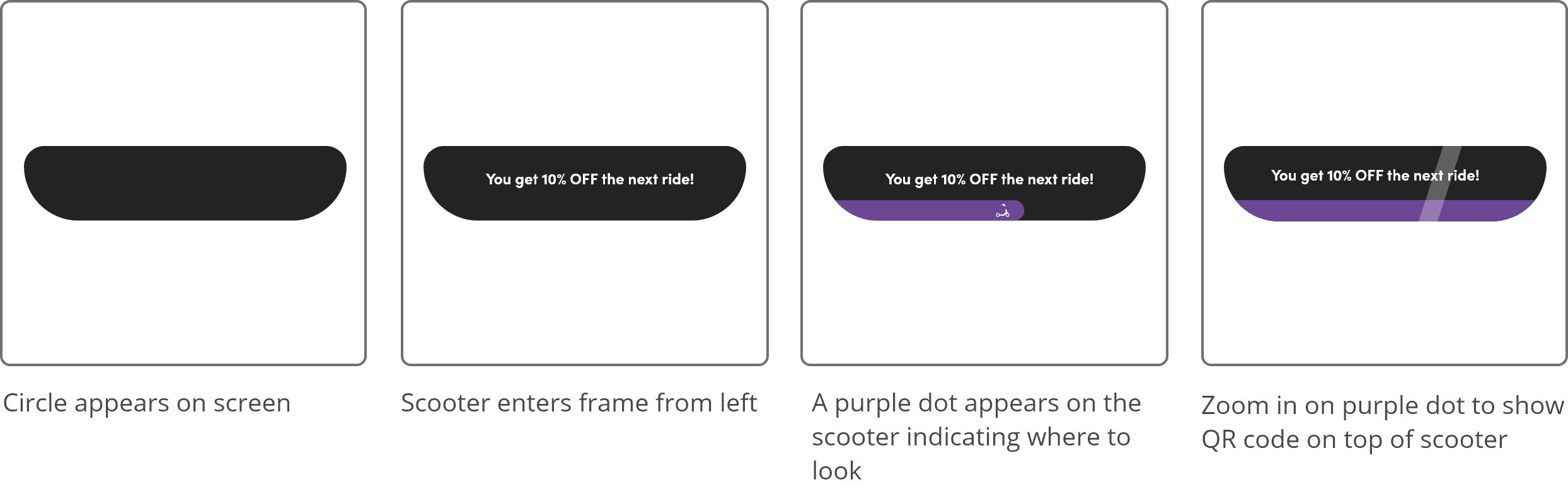
The visual cue to scan the QR code on the scooter is small and unclear. It’s unseen by users who are unsure
Draw attention to the instructions by using a growing motion that informs the user of where the QR code is located on the scooter and what it looks like.

The cost-effectiveness is not emphasized in the app through promo codes and special offers, leading users to be more drawn toward the competitor apps.
Create a pop up for special offers with a micro animation to encourage people to use them.
When creating micro animations it's important to keep them simple and use them to enhance the existing experience
This project emphasized how important narrative is when crafting a user experience. This will continue to help me build connections between my users and interfaces in the future
After this project I feel more confident using motion design as part of UI/UX design to help communicate with my user by providing feed back or helping guide them through the experience


